Designing an iOS and Android app help customers save money.

In 2018, I was the designer on Family Dollar’s first coupon-focused iOS and Android app. My role included facilitating discovery sessions, interaction design, visual design, and loads of customer interviews and test. Also on the team: an information architect, two engineers, one project manager, one business analyst. An IT and marketing team represented Family Dollar. While the work was done through an agency, we acted more as a longer-term product organization where we saw to multiple releases and iterations.
Role #
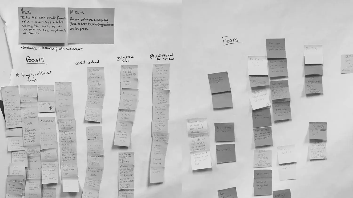
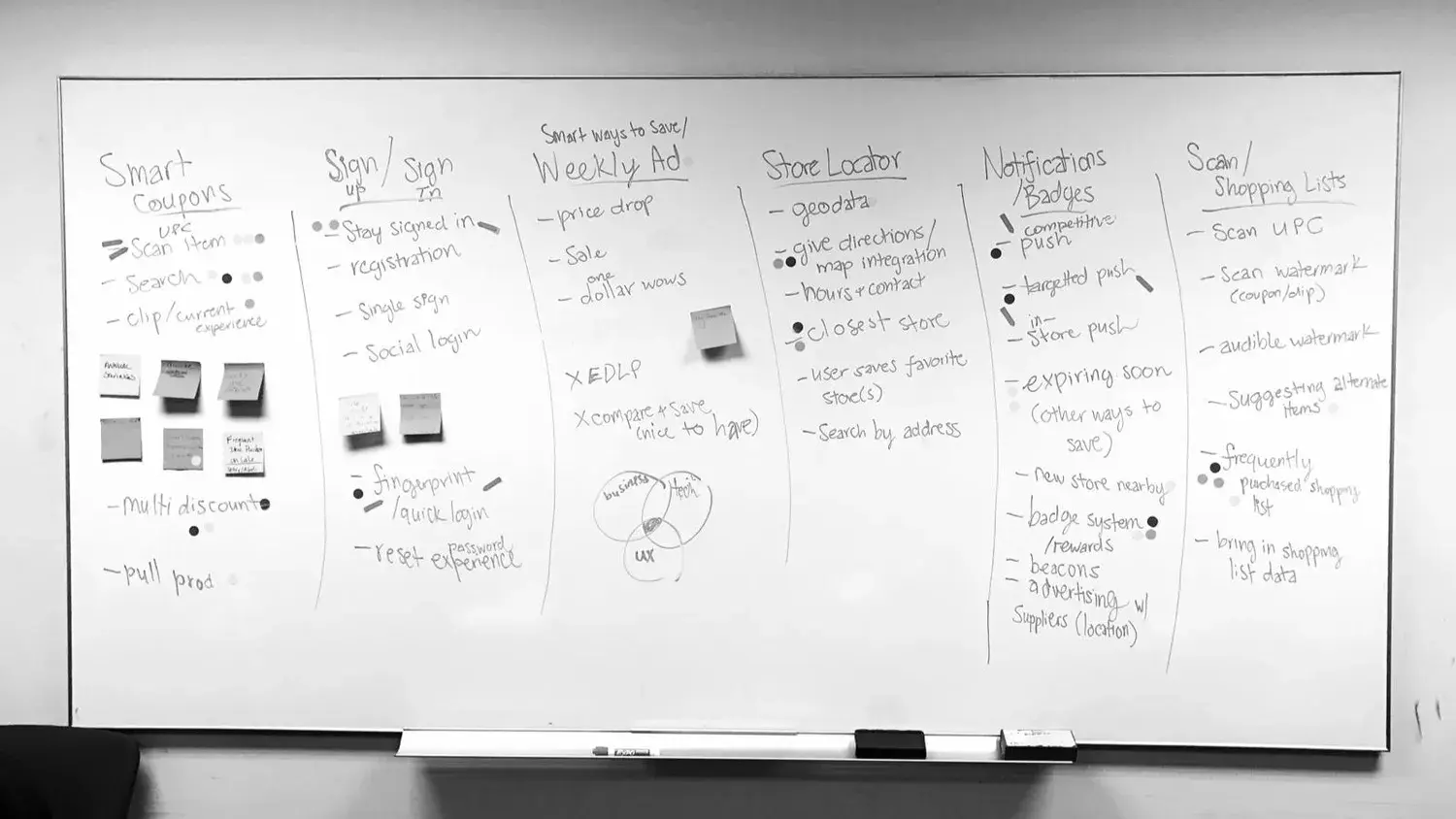
We had a month-long discovery with key stakeholders, which I led. In this time we co-created a a vision as well as a list of goals, fears, and ideas for the app. We then charted each idea by effort and impact to determine the right ones to pursue (our sweet spot was high impact, low effort). We used that information to prioritize what to test—this also helped us ensure the best match of customers’ needs and Family Dollar’s ideas.
We also needed to understand the customer’s mindset. To do that, we modeled some personas based on previously-established research.
The personas allowed us to identify the types of customers who shop at Family Dollar. However, I found nothing else was as valuable or insightful as meeting customers in person. A note here about personas: I don’t rely on them too much past initial stages of the project, as they lose value when you begin to speak with real customers.
Speaking with customers taught me they relied heavily on Family Dollar’s weekly ads to save money. They painstakingly cut coupons out to take with them to the store. Sometimes they lost coupons or they expired without their knowing. Many customers didn’t know what an App Store was, saying their grandkids install apps for them.
Challenge #
- Help a non-technical, smartphone-novice group of people understand this product
- Use gamification to make the app more enjoyable
- Increase sales and trips to the store
- Reduce checkout time by half
Approach #
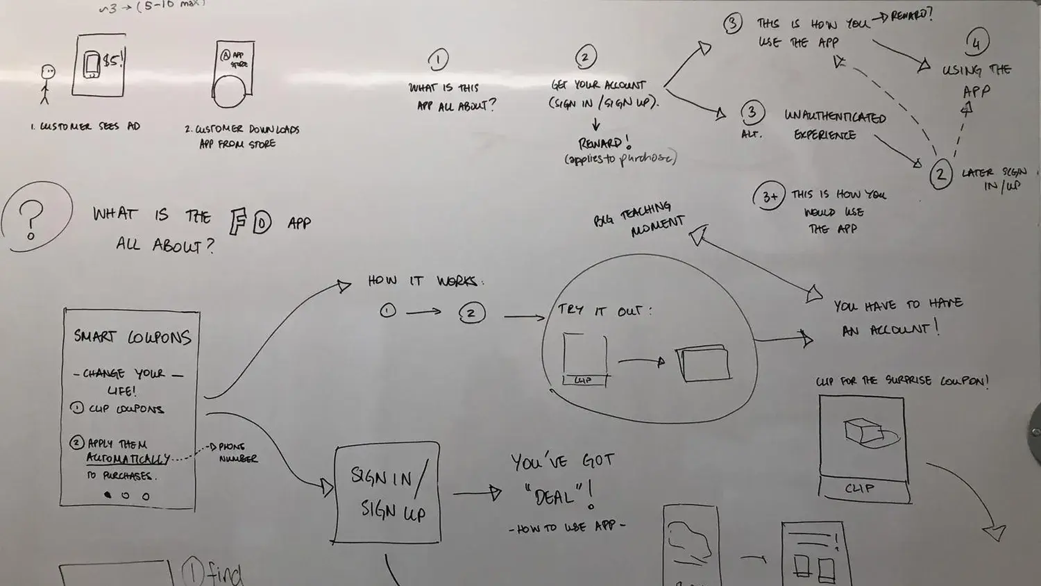
Working closely with the team, I tested numerous prototypes in-store. The goal here was to ensure we built the right product—the knowledge we gained from these user testing sessions was invaluable.
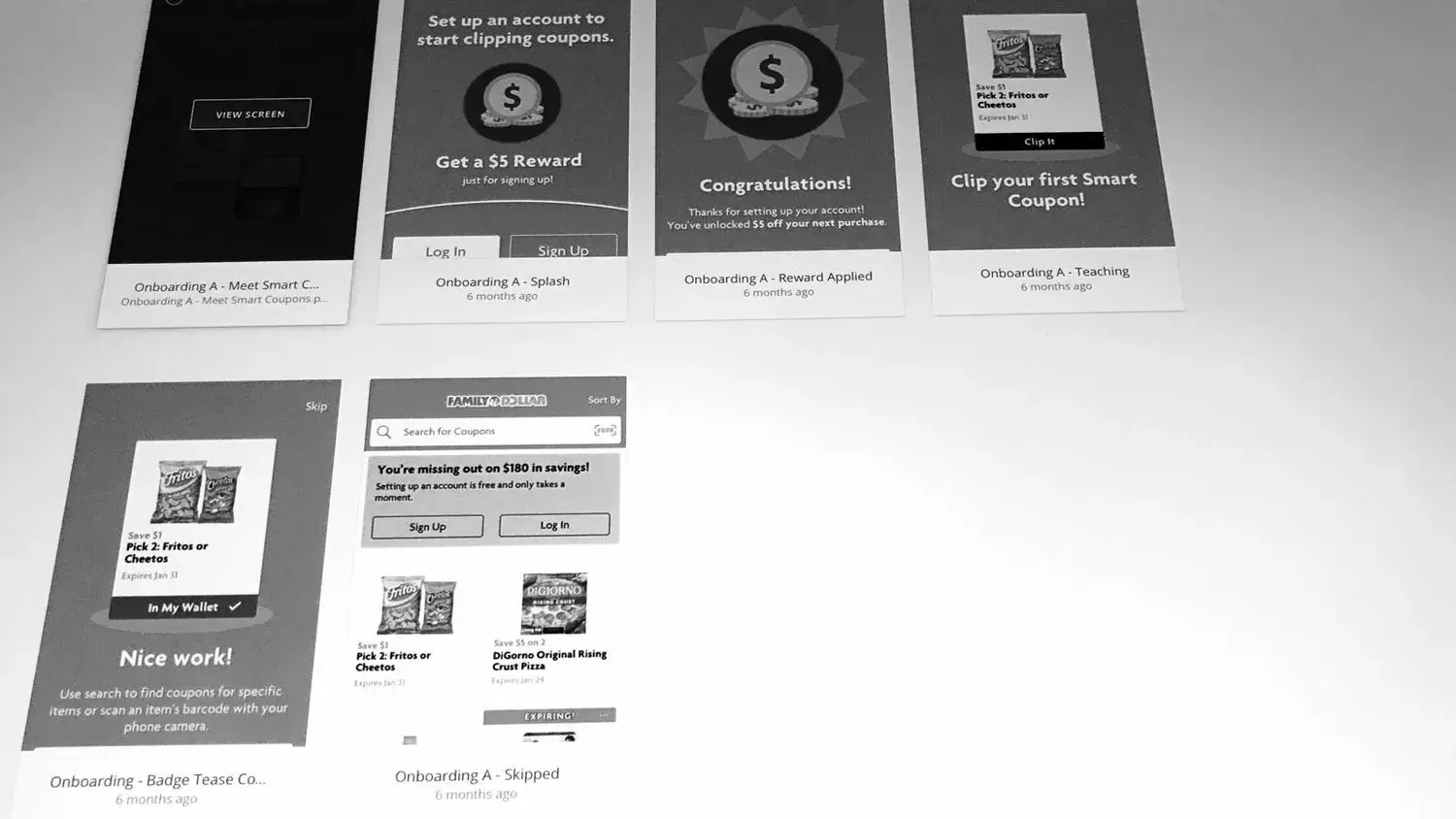
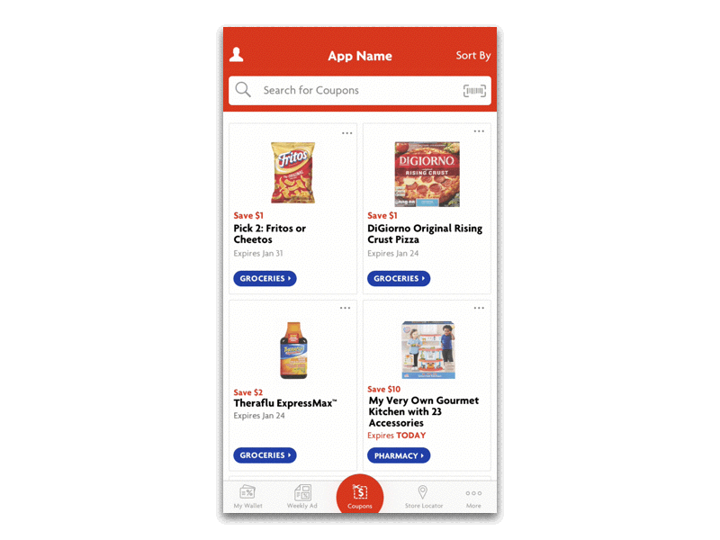
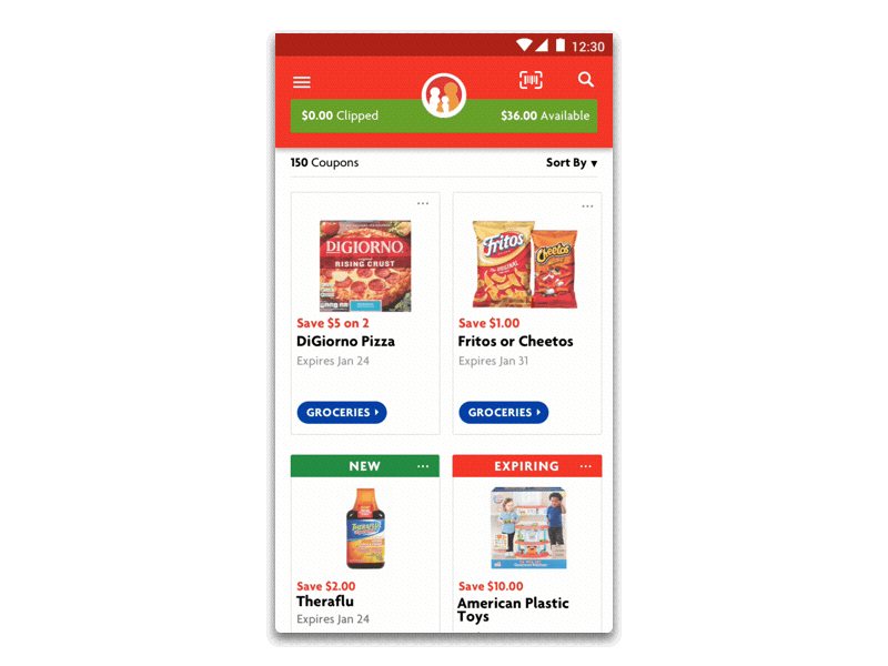
The final app includes a card-based design, which closely mimics clipping coupons in real life. That allowed customers to have faster checkout times and less hassle from lost or expired coupons.
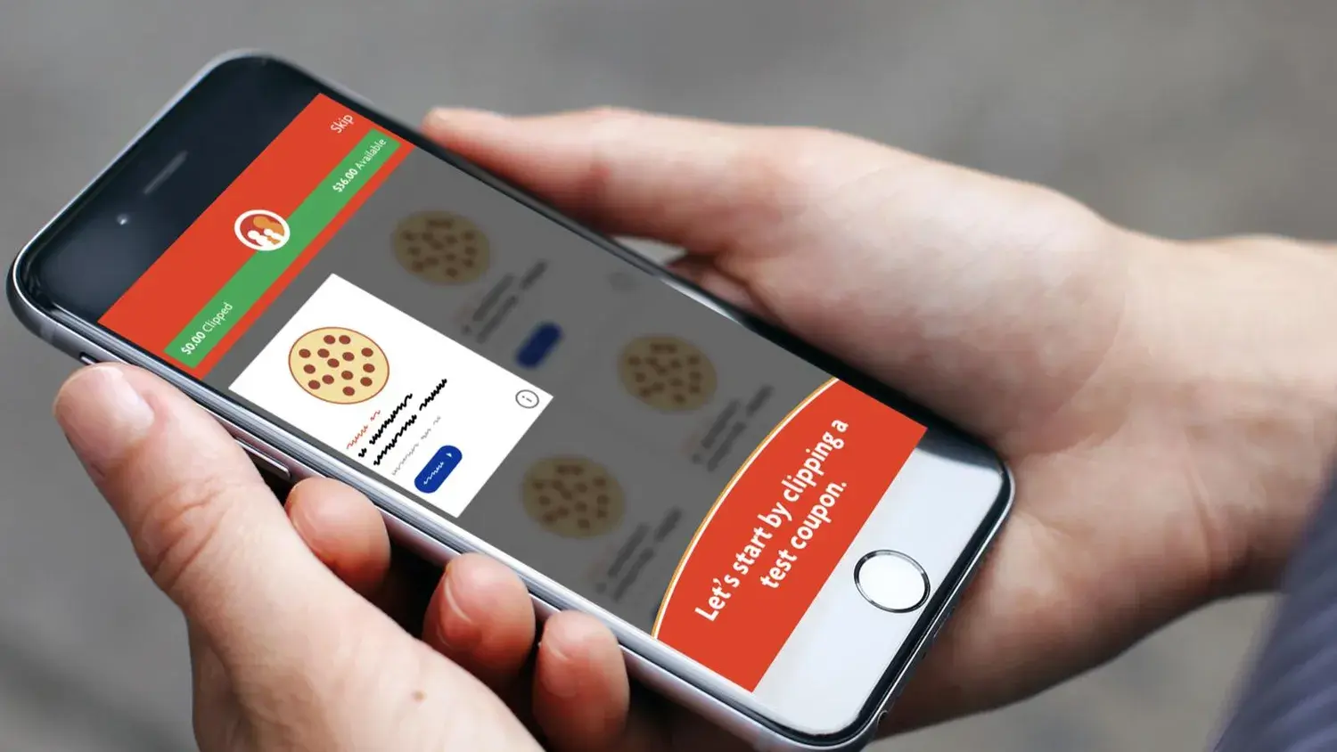
There are also fun interactions—when a customer clips a coupon, it displays a pleasing-yet-not-annoying animation. Family Dollar placed a high value on gamification, so we tested a few methods of what that might look like. Ultimately, customers related best to a filling progress bar that entices them to clip more coupons.
Results #
- Met yearly download goal in one month
- Boosted average transaction price by 50%
- Interviewed at least 75 customers
- Held a spot in the top 25 shopping apps on Google Play for 18 months
- Earned a 4.8 rating in the App Store