Designing a cross-platform mobile app and design system for EV charging.

Role #
In 2019 at Artium, I helped EVgo gain the capability to design and manage the production of their own mobile apps. I led the design side of this engagement, enabling one of their designers to do the work along the way. I also collaborated with product managers and engineers on both Artium and EVgo’s side. Our goal was to launch and iterate on both apps to ensure their product was the best it could be.
Challenge #
The challenge was interesting: help a team that has never designed for mobile create a seamless cross-platform mobile app that interfaces with EVGo’s chargers. Additionally, EVgo’s current app caused the customer support team lots of headaches. (We sat right next to them and heard first-hand). Their App Store reviews reflected this, too.
Coming into the situation, the first thing we did was begin to gather context and learn from users so that we could form a solid plan. I and the team sat with EVgo’s customer support staff, who bore the brunt of complaints, and began conducting structured user interviews. We noticed a few issues: range anxiety with drivers, ambiguity around which types chargers are available where, and no discernible design system behind EVgo’s efforts.
Reduce “Range Anxiety” and Safety Issues #
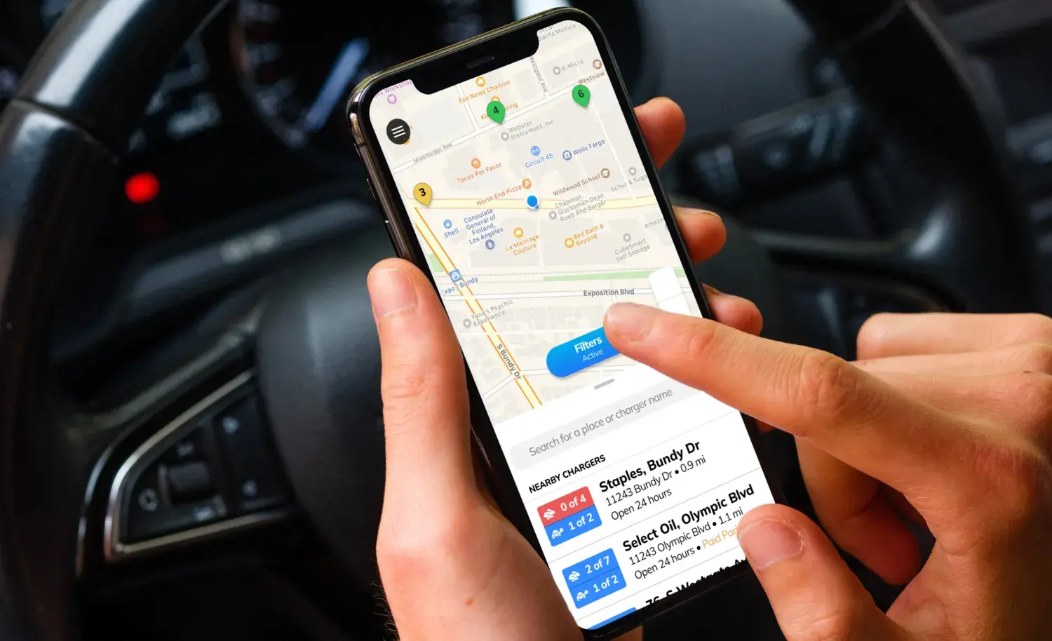
EV batteries don’t always have the best range. And chargers aren’t always easy to find or are nearby. An EV driver needs to plan their route with more care than drivers of gas-powered cars. EVgo wanted to show all chargers available to the user, even ones outside of their own network.
My discussions and interviews with both EVgo’s customer support team and their users showed that finding chargers is difficult enough, but I discovered some charging locations left drivers feeling unsafe. I worked with the team and implemented a review system and custom directions to chargers. directions were especially helpful in malls or parking decks where chargers may be tricky to find. The customer support team already spent a lot of time helping drivers with this problem.
Another issue was the tendency of other EV drivers to overstay their allotted time at a charging station, preventing someone who needed a charge from getting one. After researching this with users, I devised and tested a notification system to alert drivers who may have parked in error, as well as alerts when a driver’s charge was almost complete. (We explored messaging other drivers, but decided against that, as it could lead to more frustration and potential harassment.)
The final issue was availability. Some drivers drove to an open charger only to find it’s in use. This increased range anxiety. After working through a few ideas, I and the team implemented a reservation system. To prevent users from gaming the system and reserving multiple spots at once, we let drivers reserve one charging spot at a time and gave them a 10 minute grace period to arrive. After that, the network releases the reservation.
Create Clarity on Chargers #
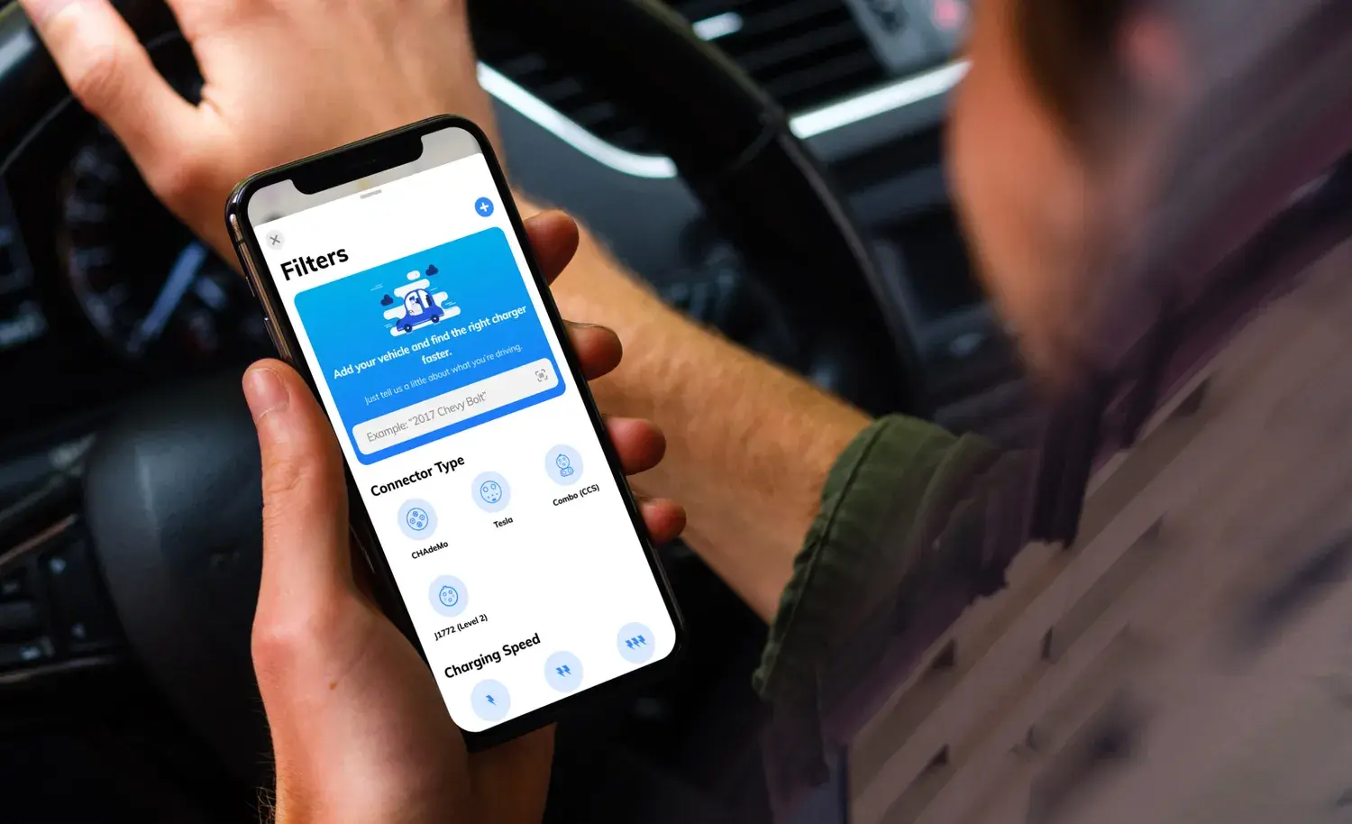
I found that it wasn’t always clear what types of chargers fit which car, and drivers didn’t always know what type of charger they had. Every company had different names for their chargers. Additionally, not all charger types were available at every location.
First, I ensured the app’s UI was crystal clear on which kinds of chargers were at what locations. I was a part of six design sessions on this issue, and it changed between the time I left and the app’s launch.
Second, and because it’s difficult for drivers to keep in mind what kind of charger they have, our client contributed a stellar idea: this information can be derived from scanning a vehicle’s VIN (vehicle identification number). After researching the possibilities, I recommended we include this during driver onboarding. This process identified the types of chargers a vehicle needed and hid incompatible chargers on the map.
Create a Scalable Design System and Workflow #
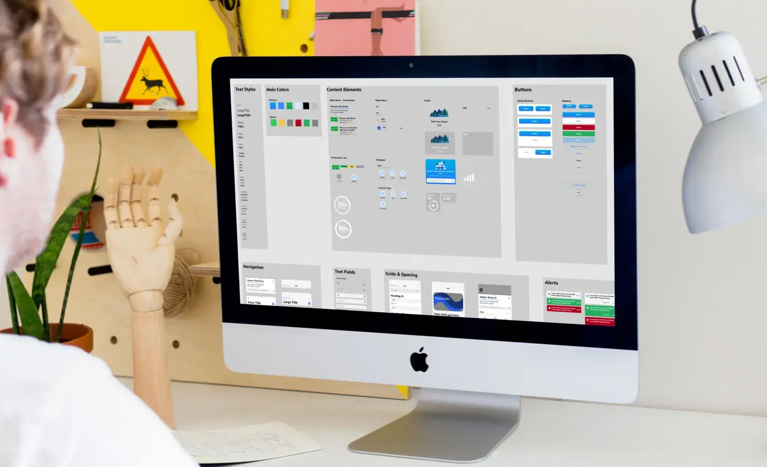
I wanted EVgo to have a consistent experience for their drivers, so I and the other designers (including the ones who designed interfaces for the hardware) got together and harmonized the typefaces and general design patterns. While each type of charger model had some variations, we were able to find a good, consistent path forward that maintained consistency with the EVgo brand.
I also built a design system for Figma. (The team liked cooking, so we called this the EVgo Cookbook). The Cookbook took into account EVgo’s unique need to give both iOS and Android users experiences that felt native to their operating system.
To ensure we got the best results, we took a page from Extreme Programming and sat beside our engineers as they developed the app. Collaborating this way ensured what we had in Figma matched what the engineers could do.
Results #
One of the downsides of consulting is that you don’t always get to see things through to launch and beyond. While that was the plan, COVID changed things and I wasn’t able to see that happen. I was, however, told that the team built a healthy culture of collaboration with PM and engineering and that they continue to build on the design system we created before I left.