Designing a cohesive, valuable experience for property owners.
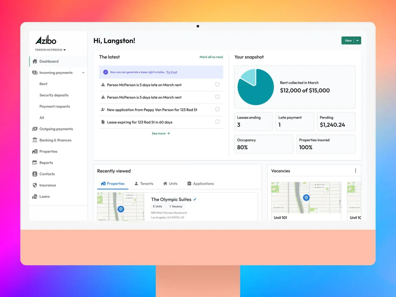
Azibo is an earlier-stage startup in the real estate business. They aim to be a one-stop shop for smaller landlords who manage their own properties by providing lease generation, rent collection, tenant screening, and accounting. Azibo also offers tools for tenants, such as paying a landlord and renter’s insurance.
Role #
I joined Azibo to build and optimize their design team. I needed to position it as a strategic partner to Product and Engineering and hire the right team. I also needed to create a design system and lead them through a restructuring of both their product and brand.
Approach #
After meeting with key stakeholders across the company from Product to Engineering to the C-Suite, I recommended we build a design system as we go in Storybook for any new initiatives and then retrofit older designs after revalidation, then work that into their rebrand.
Design System #
I pushed to create a design system, as Azibo had two key problems: nothing in Figma existed in code, which meant lots of repetitive work and inconsistency. Also, there weren’t standards for interactions and components.
Working to create a design system and pipeline, I was able to alleviate both of these issues. I needed to be respectful of the work that was done before, so I began with an audit and meeting with the team to understand that state of things.
After auditing, I consolidated and worked my way forward. I also established regular syncs with the engineering team to ensure things continued to run smoothly and had the appropriate level of bidirectional feedback.
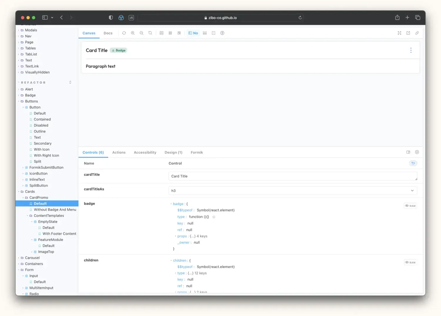
Another bonus: because we had consistency with components in Figma, and we used the design system, it allowed us to prototype instead of demoing work through static mockups or Figma workspaces. This consistency meant we can share and validate ideas quicker. That, in turn meant we can ship quicker.
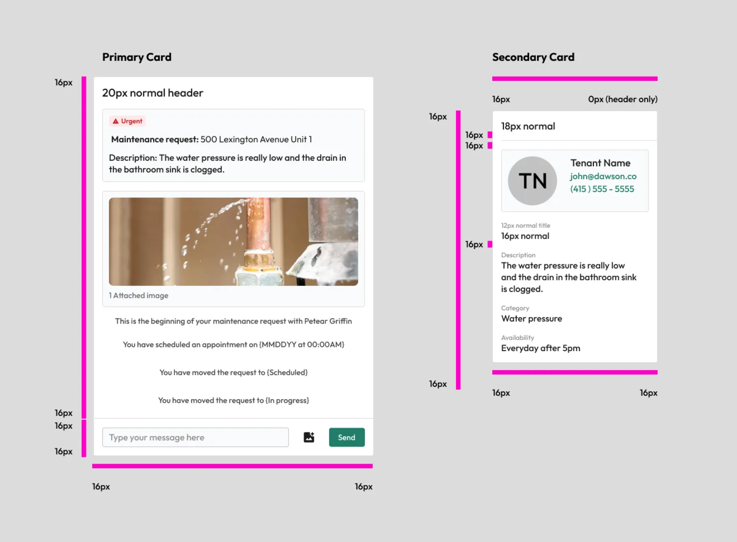
I also implemented a standardized structure for how we organize work. Our files shared a naming convention consistent with our ticketing system (Shortcut), and we standardized on only showing prototypes to stakeholders instead of walking them through our working area. This was in response to non-designers feeling lost and nodding along during presentations. Prototypes made it much easier for everyone to connect the dots and ask better questions.
Doing this let any designer—or product manager, for that matter—pick up and contribute to the work.
All of this improved velocity, quality, and the speed of the entire team’s work.

The Rebrand #
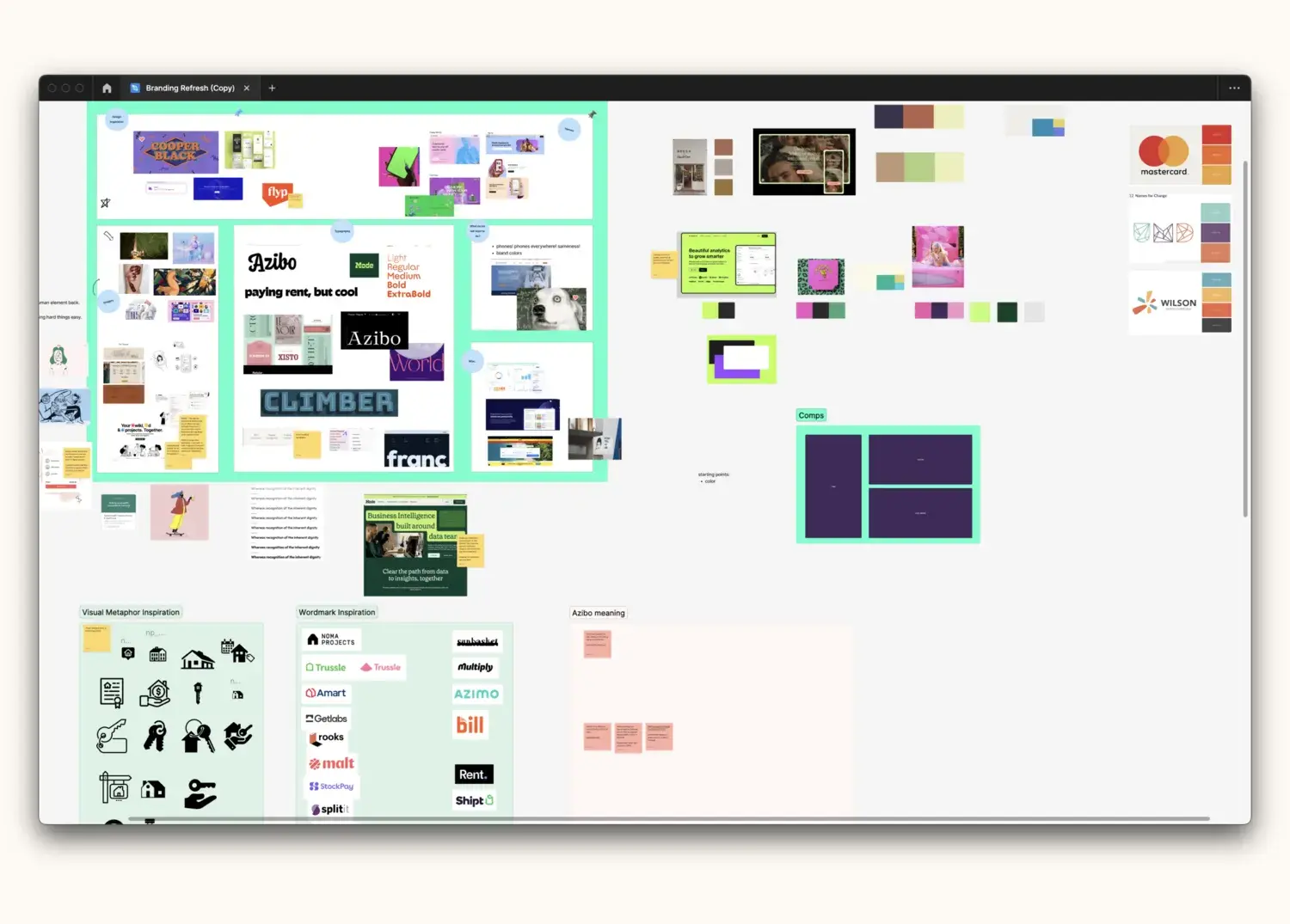
The space that Azibo occupies is difficult to conquer, and we needed to widen the top of our funnel. To do that, we developed a two-pronged strategy. The first was to differentiate ourselves from competitors. The second is a dashboard, which we’ll discuss momentarily.
The landscape was full of companies that wanted to look and sound like each other. I directed the team to take a different approach and create a more human version. Our constraints were that we couldn’t add any new colors, and we didn’t want to change the typeface. It was to be human, cute, and fun. We defined our own style, found an illustrator who could create an illustration library, and launched the site within six weeks.
This rebrand wasn’t just about looks, either. We needed to consider how the brand sounded and acted. So that led us to rewrite the UI and email templates, especially those crucial first emails one receives from Azibo. We found a novel use for ChatGPT here, namely in editing and keeping a consistent voice. I wouldn’t advocate using it for much more than that, but it’s a great resource for making sure your grammar is on point.
I created a brand bible that guides the rest of the company so that everyone could have autonomy to move quickly without relying on bottlenecks or the design team to do something.
Striking the balance between where a new brand shows itself and the product itself was difficult. I looked at this rebrand like a bridge. As you begin to cross it, you see less of the marketing and more of the product. And in areas where you needed more referrals, it had a little heavier marketing in it. This worked well because the design and marketing teams were so heavily collaborative.
A New Website #
One key area the company struggled with was spinning up marketing pages and making changes on their WordPress site. They were reliant on a third-party developer, which meant lots of overhead for making changes. As part of the rebrand, I wanted to give them a low-code solution that would let them work on their own.
This meant I created templates inside of Webflow, with perfectly styled components that they could easily drag onto a new page. After a little training, they could spin up an infinite number of landing pages, A/B test, and optimize the site accordingly.
You can view the website at Azibo.com. If you’re curious, here’s the before version.
The Dashboard #
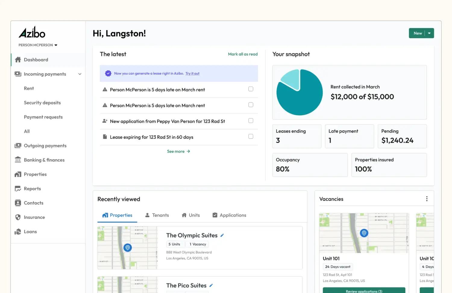
The second way Azibo would win is by thinking less about having a list of features and more about optimizing how each feature works in concert with the others. That’s where the dashboard comes in. The goal for this work was to drive more monetization of products after the customer came on board. Azibo frequently acquired landlords who kicked the tires but couldn’t quite figure out where to get started and how to activate more products. It was somewhat designed as an NPS driver as well as a monetization driver post acquisition.
The previous dashboard experience was the least trafficked part of the site, despite being the first place a customer lands. I wanted to avoid a bunch of neat-looking but ultimately less useful widgets in favor of providing landlords exactly what they needed in that moment to run their business.
To do that, I interviewed landlords through live sessions, surveys, and other services like Pendo and heatmaps. I also brought in the customer success team to help landlords.
What came to fruition was a system that:
- Distributes onboarding so that customers can get to work faster
- Provides important updates through a notification center that also serves as a way to customize onboarding per customer type
- Serves as the launchpad for future growth and ideas; it’s where everything ties into the product
- Resolves the top customer service issues that lead to attrition
Other Leadership Efforts #
I had the pleasure of hiring phenomenal talent and growing junior (yet still phenomenal) talent. I worked to create a cohesive design team culture and be an ally to other leaders in the company.
First, I implemented pairing sessions with designers, which served to cross-pollinate ideas and domain expertise as well as build strong relationships.
I also built a research practice and hired an expert to take it over. This helped inform our product decisions and backlog. I established a rubric so we didn’t unnecessarily adhere to a process. After all, not everything needs validation. Here it is: If the cost of being wrong is high, we validate before. If the cost is lower, we can follow our gut and validate smaller things pre-launch or by shipping a micro-survey through Pendo after we launch.
Finally, I supported designers in ways that were unique to them, as no two designers are alike. Each needs specific domains to work in, and I worked to find them the right places to slot in and the right people to collaborate with so they’d grow. It also meant spending time with them one-on-one in pairing sessions to give them the support they need.
Results #
- Reduced call center volume by 20%
- Eliminated calls to cancel, increasing customer retention
- Received rave reviews from customers
- Boosted engagement by 30% with other products